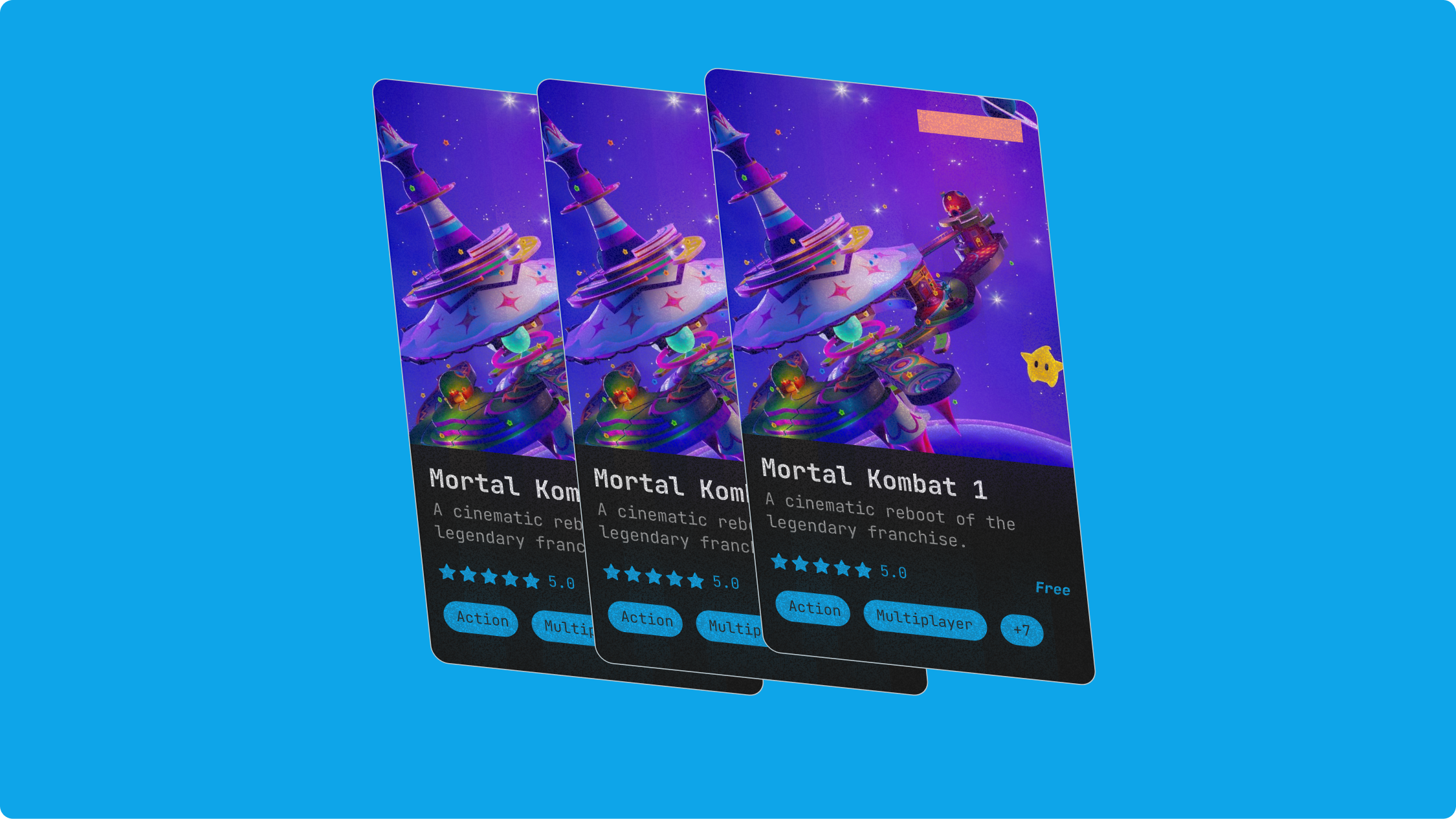
GameSense
A swipe-based discovery feature for Conduit Gaming that helps players find indie and under-the-radar games. Built around the bet that game discovery is a curiosity problem, not a search problem.
Timeline
4 weeks (Apr to May 2026)
Role
Solo UI/UX Designer (Contract)
Outcome
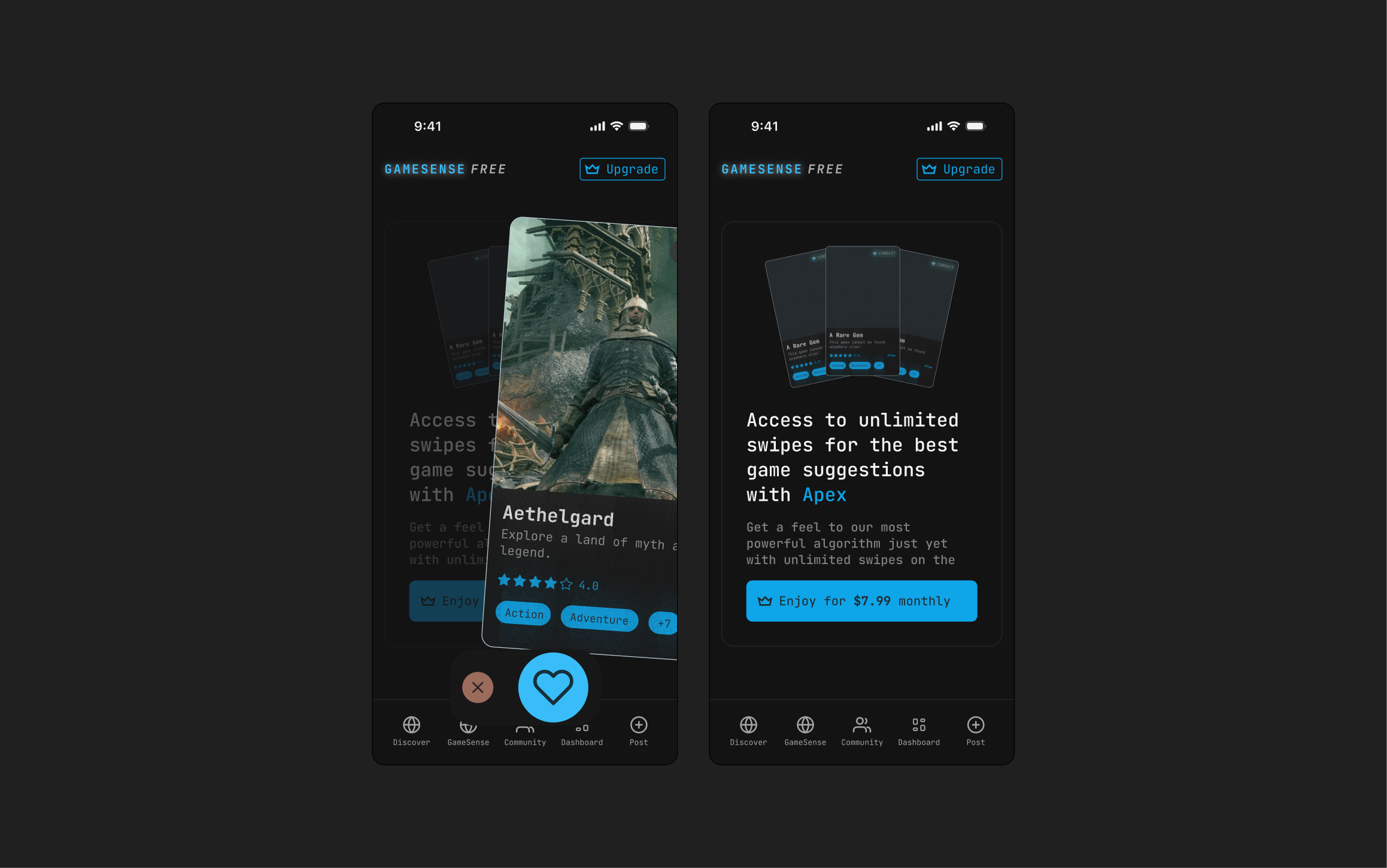
Mobile and desktop hi-fi prototypes shipped to engineering. Feature is currently in QA on staging with first-iteration functionality built out, and is preparing to launch summer 2026.
Overview
What is Conduit Gaming?
Conduit Gaming is a pre-seed startup building tools for gamers to discover, organize, and engage with games beyond traditional storefronts. The company started as a way to save and share Minecraft server playlists, then expanded as the team saw the same discovery problem across the broader gaming landscape.
GameSense is a feature inside Conduit's product, accessed through a tab in the main nav. The team is positioning it as the value proposition they'll lead with when pitching investors at the next stage, which shaped the scope and stakes of the work.
Why This Project
Building a discovery experience that feels like play.
When Nick pitched the swipe pattern, I was excited and skeptical in roughly equal measure. Excited because the contract was a chance to own a feature end-to-end and bring some play into a category that usually defaults to grids and filters. Skeptical because Conduit's users are gamers, and gamers live on desktop. A swipe gesture is native to a phone in your hand on the subway, not a mouse in front of a monitor at 11pm. The first thing I pushed for was making GameSense work cross-platform from the start, so we could test the gamified premise in the environment where these users actually are.
The design question I went in curious about was smaller and more tactile than the strategy questions: how do you fit a game's metadata onto a card that has to read in a fraction of a second during a swipe? Games carry a lot of signal (platform, genre, tags, multiplayer support, release year, art style), and some of it is optional, so cards have to handle missing fields without looking broken. Swipeable cards are usually built for one or two glanceable attributes (a face, an age, a distance). A game card has to do more, faster, and degrade gracefully when the data is sparse.
Initial Problem Discovery
Three design problems, pulled apart.
I broke the swipe-card brief into three smaller design problems and pulled reference for each one separately, instead of treating "the card" as a single object to study.
3.1 Swipe onboarding: how do you teach the gesture without a tutorial wall?
Reference set: short swipe-tutorial flows from existing apps. The pattern most of them use is a dedicated 3 or 4 screen sequence at first launch ("slide right to like, slide left to pass, swipe up for more"). It works, but it front-loads instruction before the user has anything to react to.
For GameSense, we considered an onboarding moment but scoped it out of the MVP. The bet was that the gesture is now familiar enough across apps that most users can intuit it from the card stack itself, with subtle visual affordances doing the teaching. If retention data shows otherwise, onboarding is the first thing to add back.
3.2 Swiping cards: where does the interaction itself come from?
Reference set: Tinder, Instagram's "See more of what you love," and physical trivia/party card decks. I deliberately included a physical reference because the digital ones all share a screen-bound vocabulary (tap, drag, snap-back), and I wanted to remember that the swipe gesture is borrowing from a much older interaction: flipping through a stack of cards in your hands.
The thing I took from Tinder was the stack itself, not the dating app metaphor. Seeing the next card peeking behind the active one is what makes the deck feel finite and tactile, instead of feeling like an infinite scroll dressed up. The thing I took from physical decks was the weight of the gesture: a real card flip is committed and irreversible. I wanted the digital swipe to carry some of that weight, which later shaped the tilt and animation iterations.
3.3 The info card itself: how do you fit game metadata onto a glanceable surface?
Reference set: Yu-Gi-Oh and Pokémon trading cards, Pokémon Go's profile and Pokédex cards, and a mix of indie game-style info cards. Trading cards were the most useful reference because they're built around the exact constraint I was facing: dense, optional, semi-structured metadata (attack, defense, type, rarity, edition) arranged so a player can read the card in under a second across a table.
What trading cards do well is hierarchy through fixed zones. The art is always in the same place, the name is always at the top, the stats are always at the bottom. Missing fields don't break the layout because every zone has an expected shape. That principle, fixed zones with graceful fallback, became the foundation for the GameSense card's metadata structure.
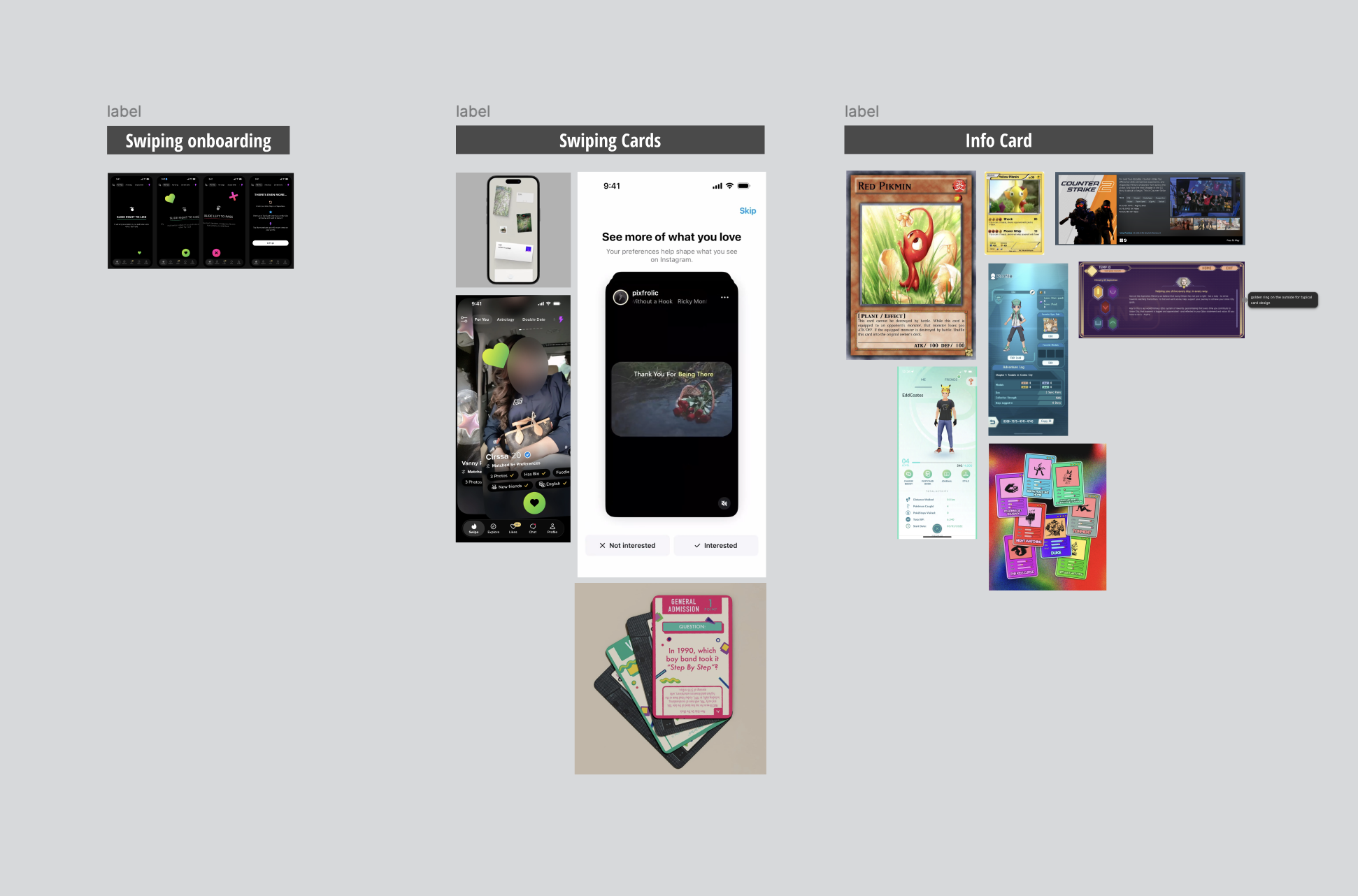
Reference board, broken into three problems: swipe onboarding, the swipe interaction, and the info card itself.
Card Anatomy
Zones, not freeform layout.
Before iterating on motion or layout, I broke the card itself down into a fixed set of zones. The front of the card carries six required and one optional element: media (1), title and short description (2), average rating (3), genres (4), price (5), and an optional promotion badge (6). The back carries long description, developer/publisher, gallery, platform, and a link to the game.
Two principles came out of this anatomy work and held through every later iteration:
- Media stays on top, always.Even when user feedback asked for genre tags to move further up, media kept the dominant zone because that's what catches the eye first when a card enters view. It's the same psychology behind why trading card art is always front-and-center.
- Optional zones (like the promotion badge) reserve their slot but don't break layout when absent. The card looks the same with or without them.
Defining the anatomy this early meant later iterations were about motion, focus, and translation, not about re-litigating where things go.
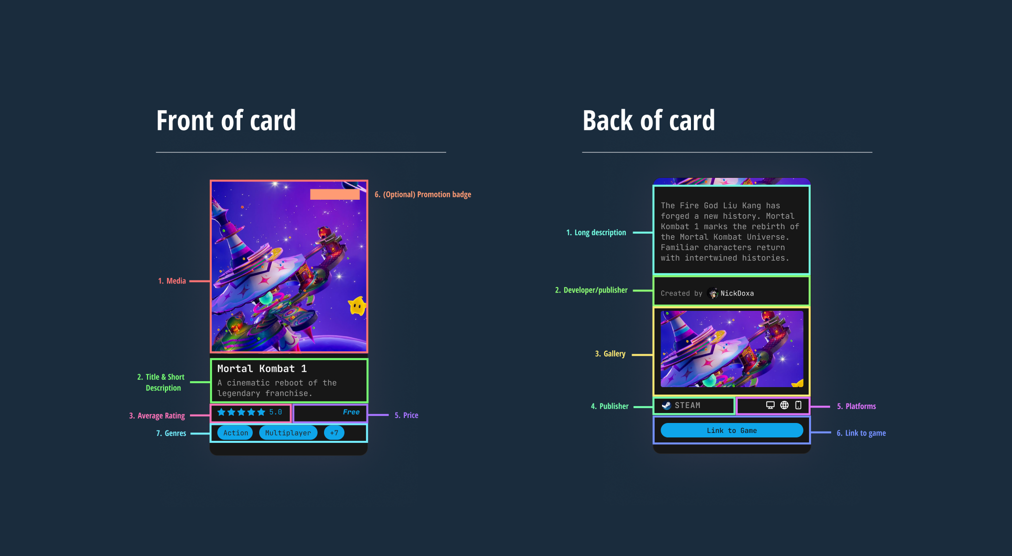
Front and back of the GameSense card, broken into fixed zones.
Notable Iterations
Three decisions worth showing.
5.1 Card tilt angle: finding the sweet spot between boring and overwhelming
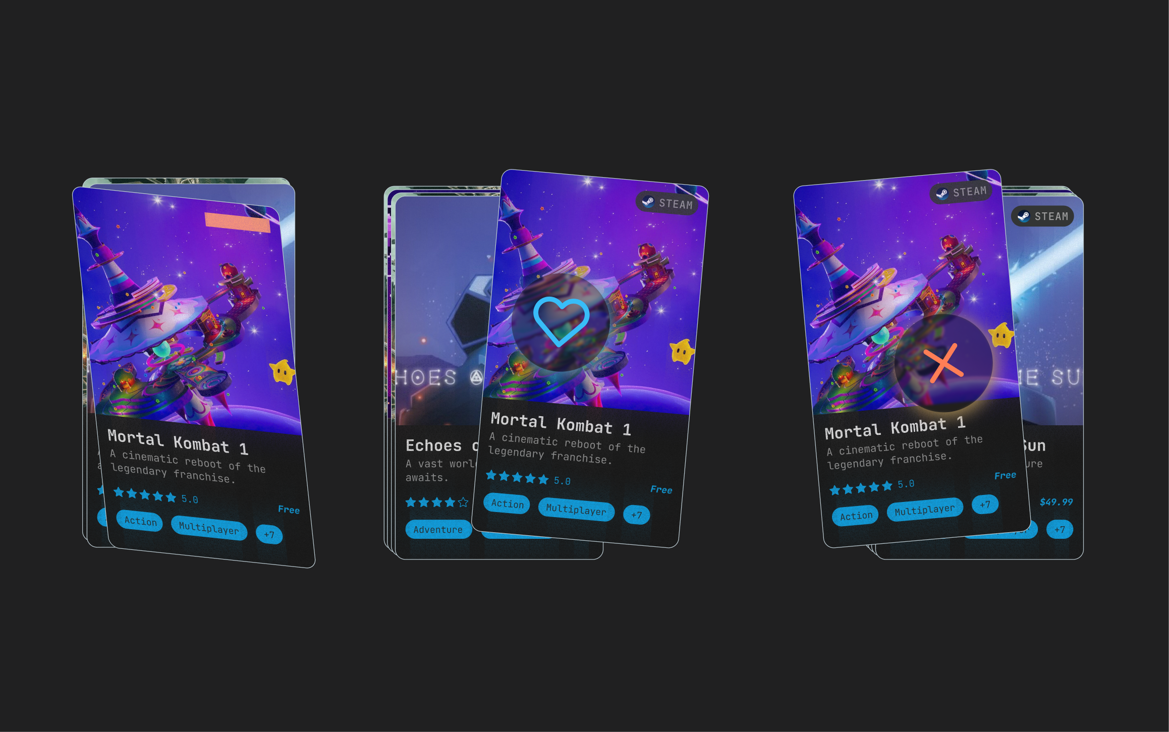
I tested three tilt angles for the active card during a swipe: 3°, 5°, and 15°.
- 3° was too tight. You couldn't really see the difference between the active card and the stack behind it, and the gesture didn't feel dynamic enough to register as a real choice.
- 15° was too dramatic. The card swung so far that the act of choosing started to feel overwhelming, like every swipe was a high-stakes commitment.
- 5° landed as the sweet spot. Enough motion to feel responsive and tactile, not so much that the user starts second-guessing every swipe.
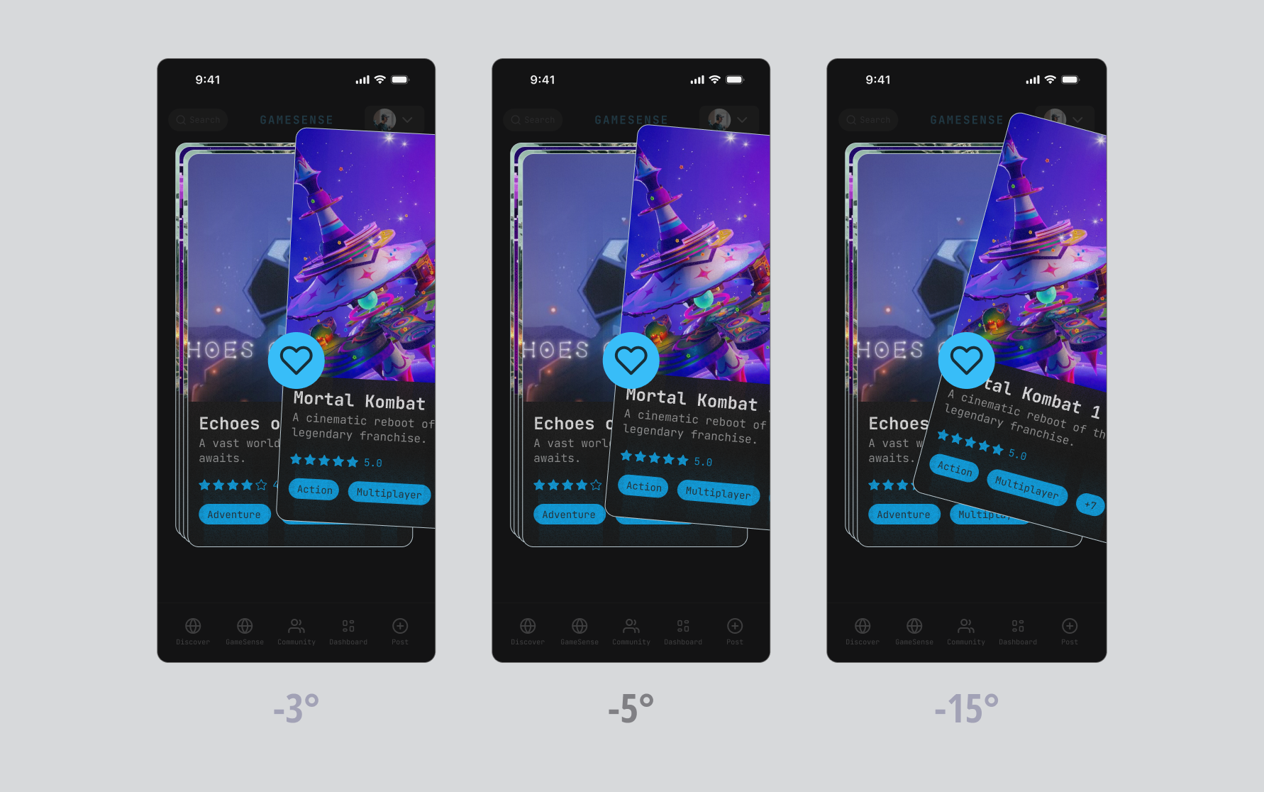
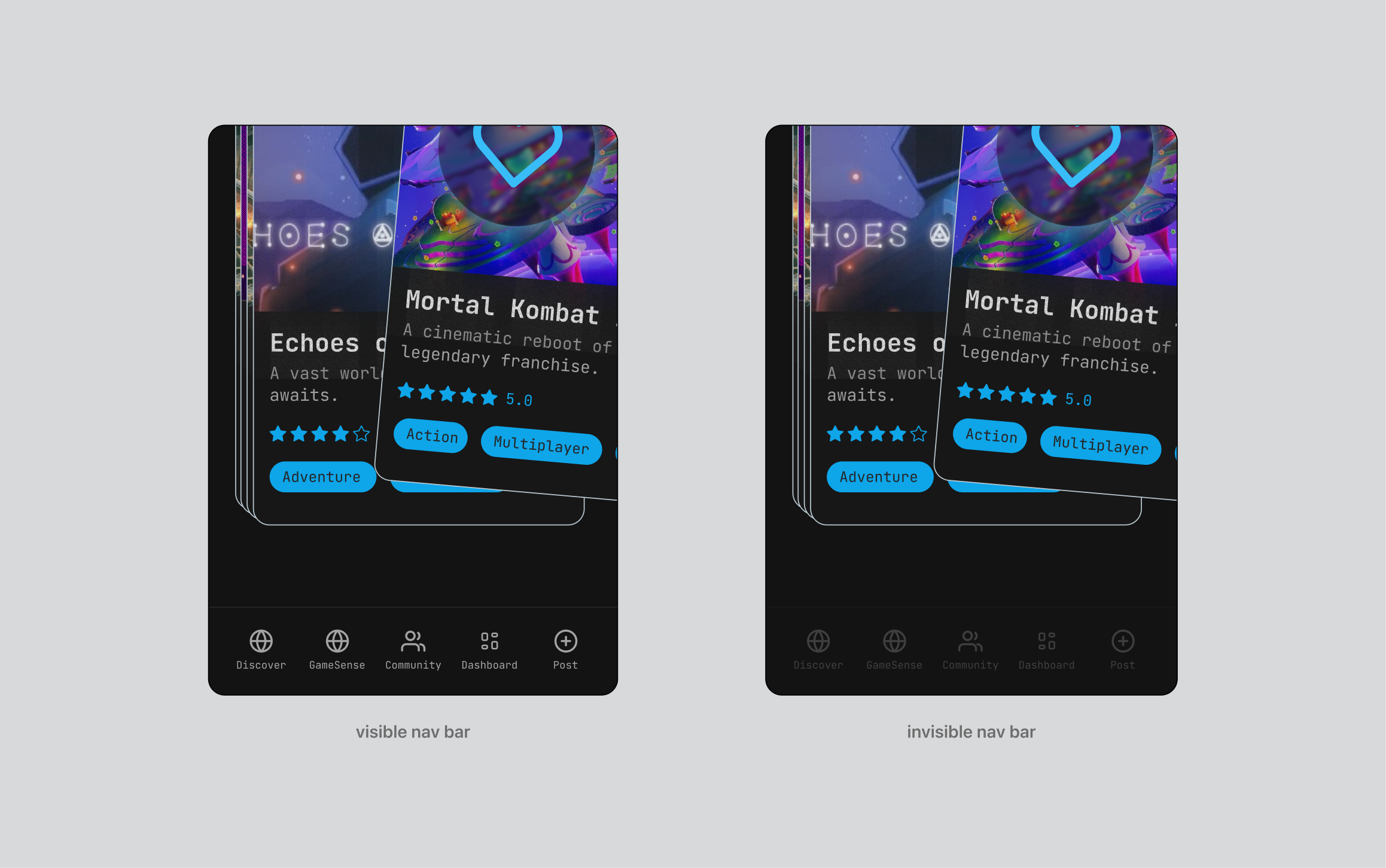
5.2 Nav bar blur during swipe: protecting focus
I tested keeping the nav bar sharp versus blurring it the moment a swipe starts. I landed on blur. The job of the swipe moment is to make a single decision about the card in your hand, and a sharp nav bar in peripheral vision pulls attention toward navigation options the user doesn't need right then. Blurring it reduces cognitive load and lets the card carry the whole frame.
5.3 Desktop translation: unstacking the deck without losing the deck feel
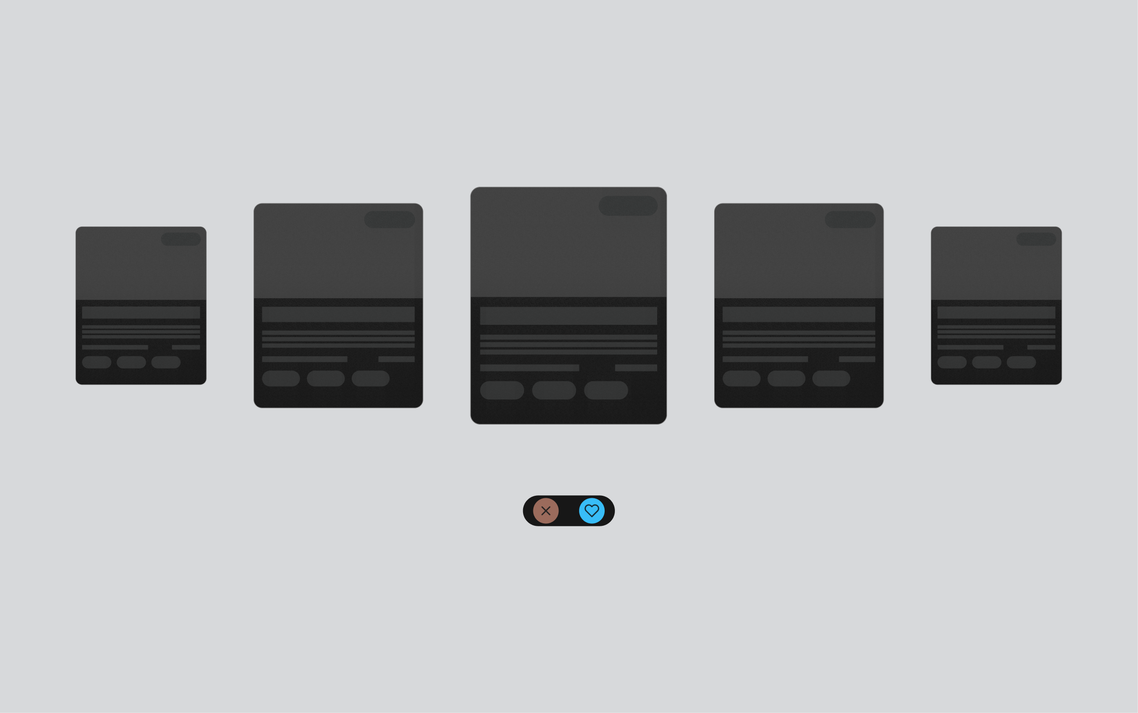
The hardest translation problem was figuring out what swipe becomes on desktop. Stacking cards on top of each other works on mobile because your thumb is already touching the screen, but on desktop a stack just sits there waiting to be clicked, which kills the gesture-driven feel.
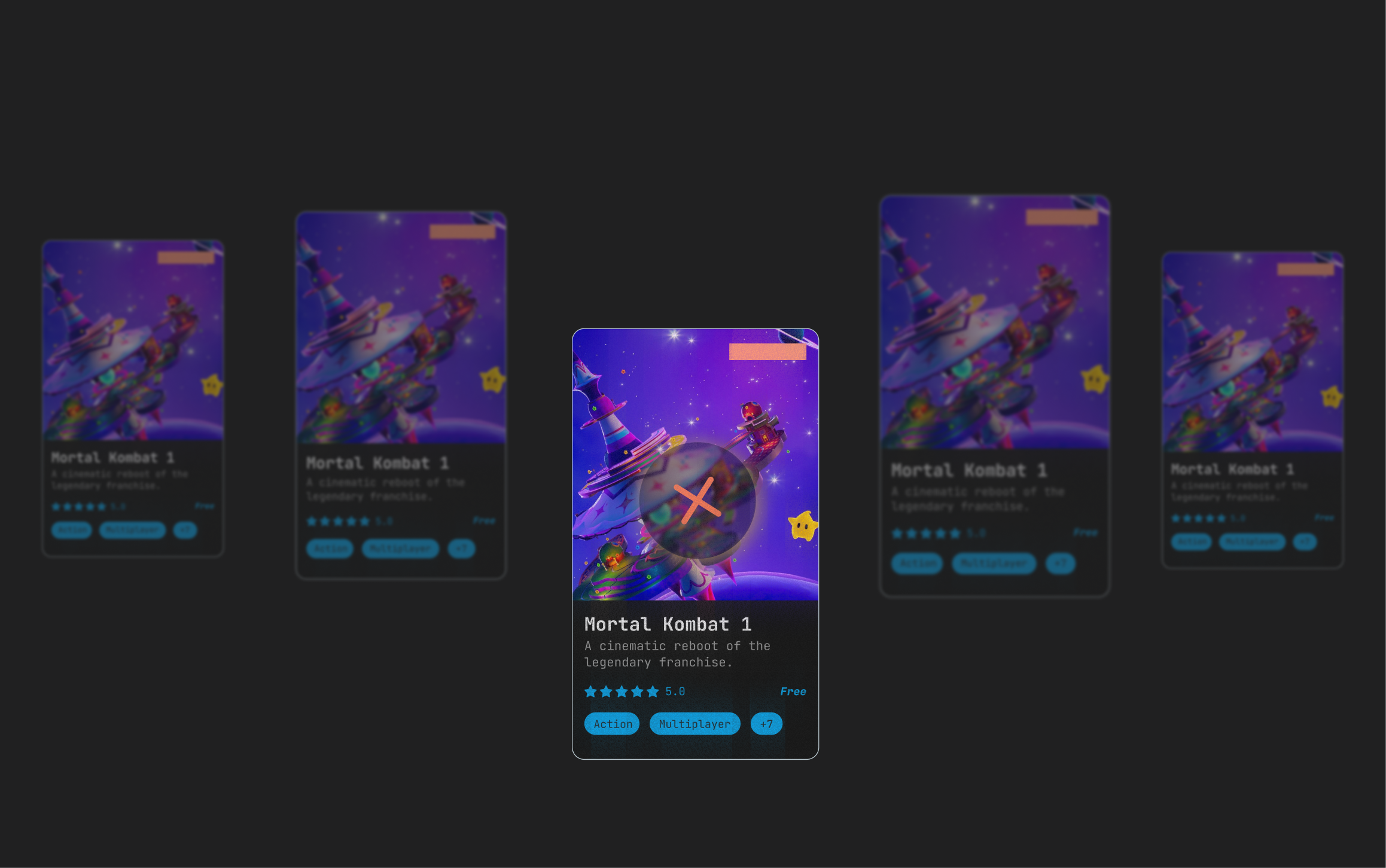
I landed on a 5-card horizontal carousel with only the center card in sharp focus and the four flanking cards blurred. The blur trick from the mobile nav bar carried over here as a focal device: the user always knows which card is "active" because everything else softens around it. Liking is mapped to arrow-up and passing to arrow-down (with the inverse on click), and the animation when a card moves out resembles the shuffle of a physical deck. The desktop version doesn't try to imitate the mobile swipe, it borrows the same underlying metaphor (a deck of cards in motion) and finds new gestures that fit the input device.
Final Designs
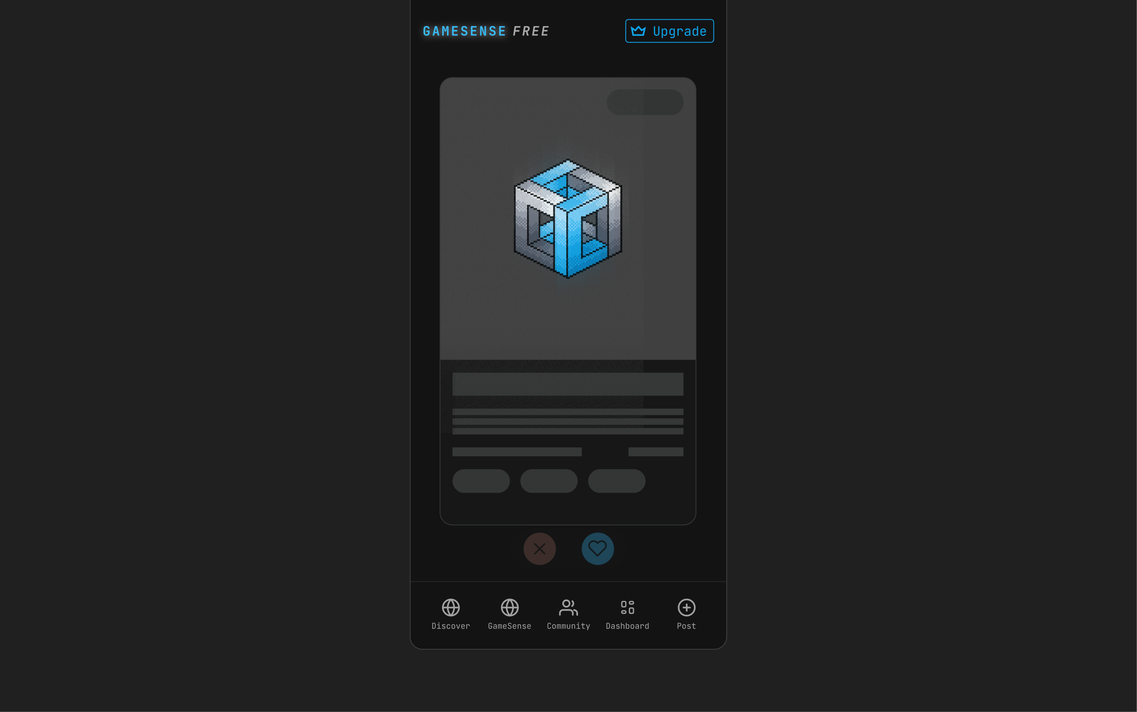
Mobile and desktop, currently in QA.
Mobile and desktop, in QA on staging, preparing to launch summer 2026.
Retrospective
Creativity has to live inside technical reality.
I checked with engineering before proposing any animation that would ship to production. The 5° tilt and the desktop blur both survived this filter; a few more elaborate ideas didn't, and the design is better for it.
Designing for gamers requires a different mental map.
Gamers carry interaction muscle memory from games themselves (WSAD, arrow keys, hover states with rich tooltips) that most product designers don't account for. Getting comfortable with this audience meant getting comfortable with unconventional inputs as a starting point, not an exception.
Don't break what works.
I came in ready to reinvent the card, but the most important decisions ended up being the conventional ones: media on top, title below, metadata at the bottom. The art of this work is balancing creativity with the patterns that already guide users well, and that's the muscle I'm still building.