City Harvest
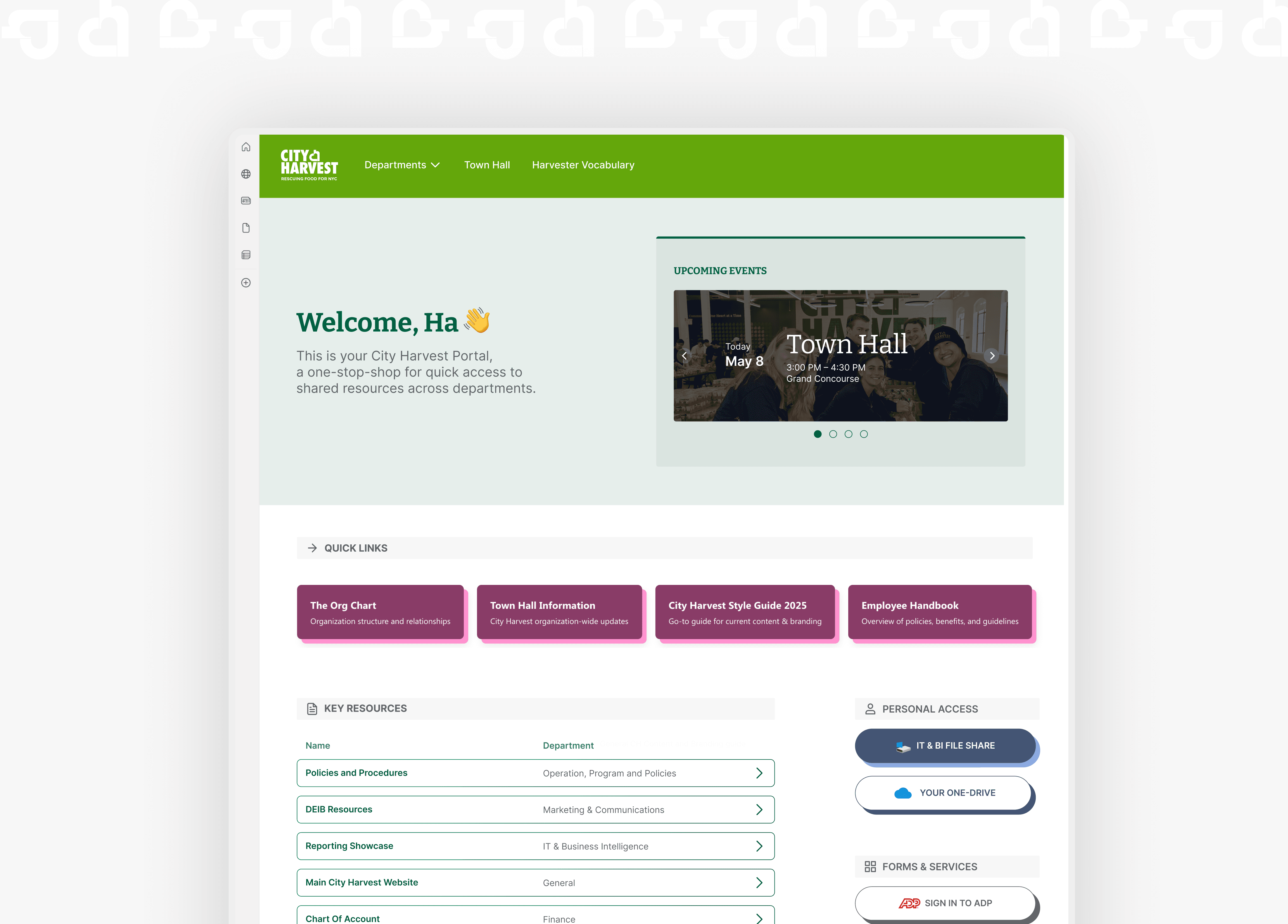
Redesigned the SharePoint intranet portal for City Harvest, one of NYC's largest food rescue nonprofits.
Timeline
3 months (Jun – Aug 2025)
Role
Product Designer
Outcome
Redesigned portal for immediate usage, hi-fi prototype and detailed research deck.
Overview
About City Harvest
City Harvest is one of the largest New York nonprofit organizations, rescuing and delivering food for New Yorkers experiencing food insecurity.
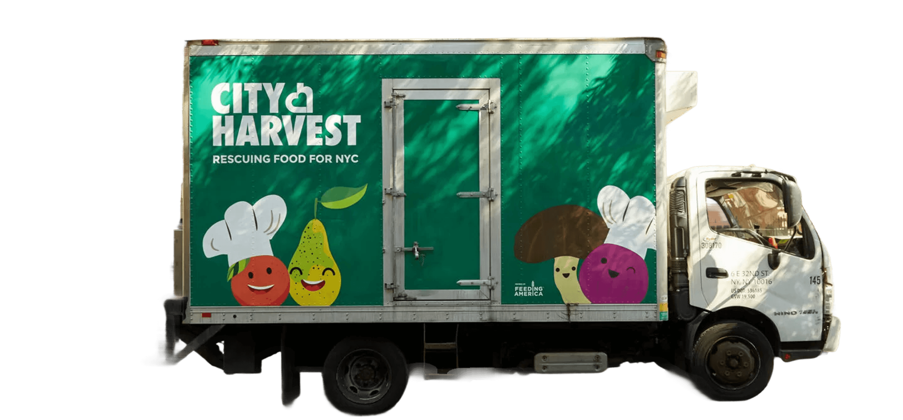
The very truck that visits my neighborhood in Bedstuy every Tuesday :D
Why a redesign? — Fragmented communications & resource sharing pipeline
In 2021, City Harvest published its organization-wide SharePoint intranet with the hope that resource sharing would be centralized. However, the original design does not support this well.
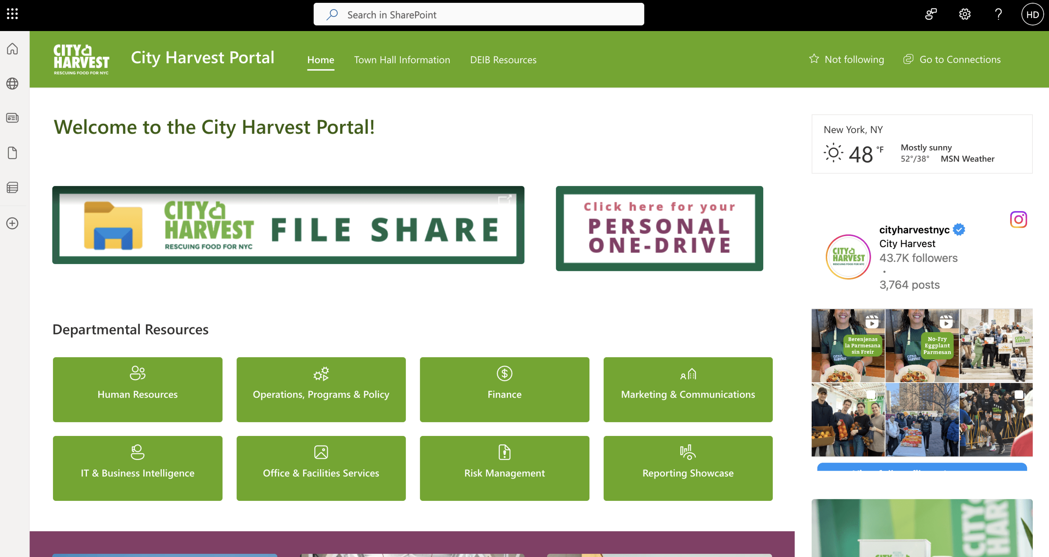
State of the portal in Feb 2025
Project goals
- Improve navigation — Refine navigation so employees can locate essential information regardless of portal familiarity.
- Streamline communication — Improve internal content management experience to reduce inaccurate information.
- Increase adoption — Improve content and layout design to increase engagement and confidence in portal exploration.
How might I reorganize information on the portal to increase communication efficiency for Harvesters?
Solution highlights
An easy-to-skim portal and a scalable mini design system.
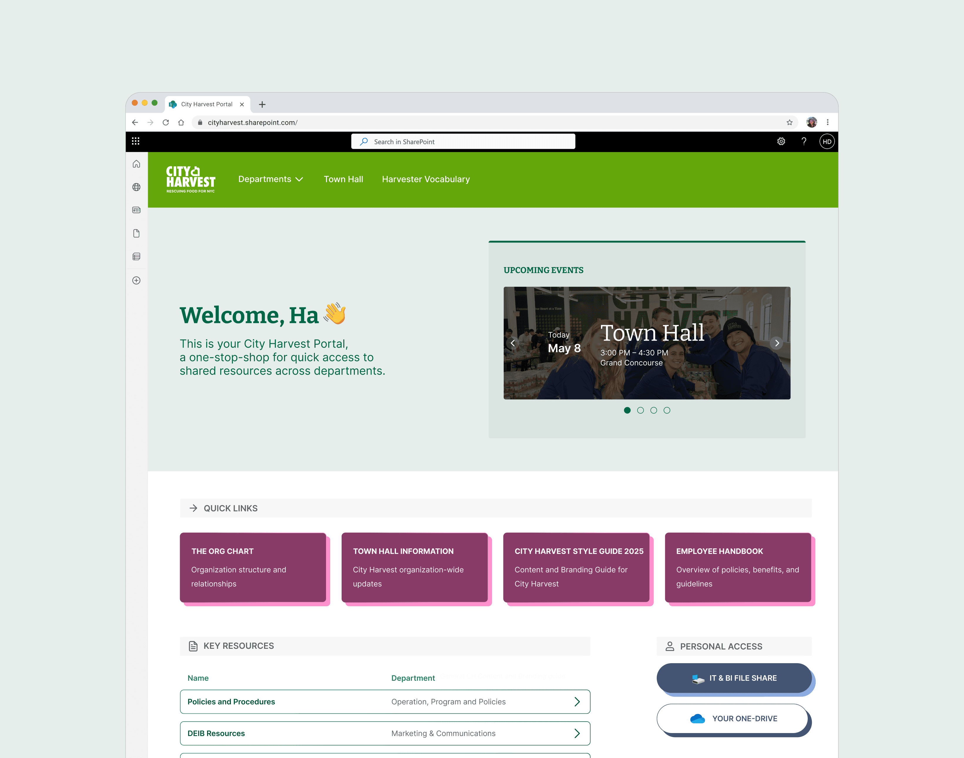
Home page with reorganized information architecture
New design system with new button/file components
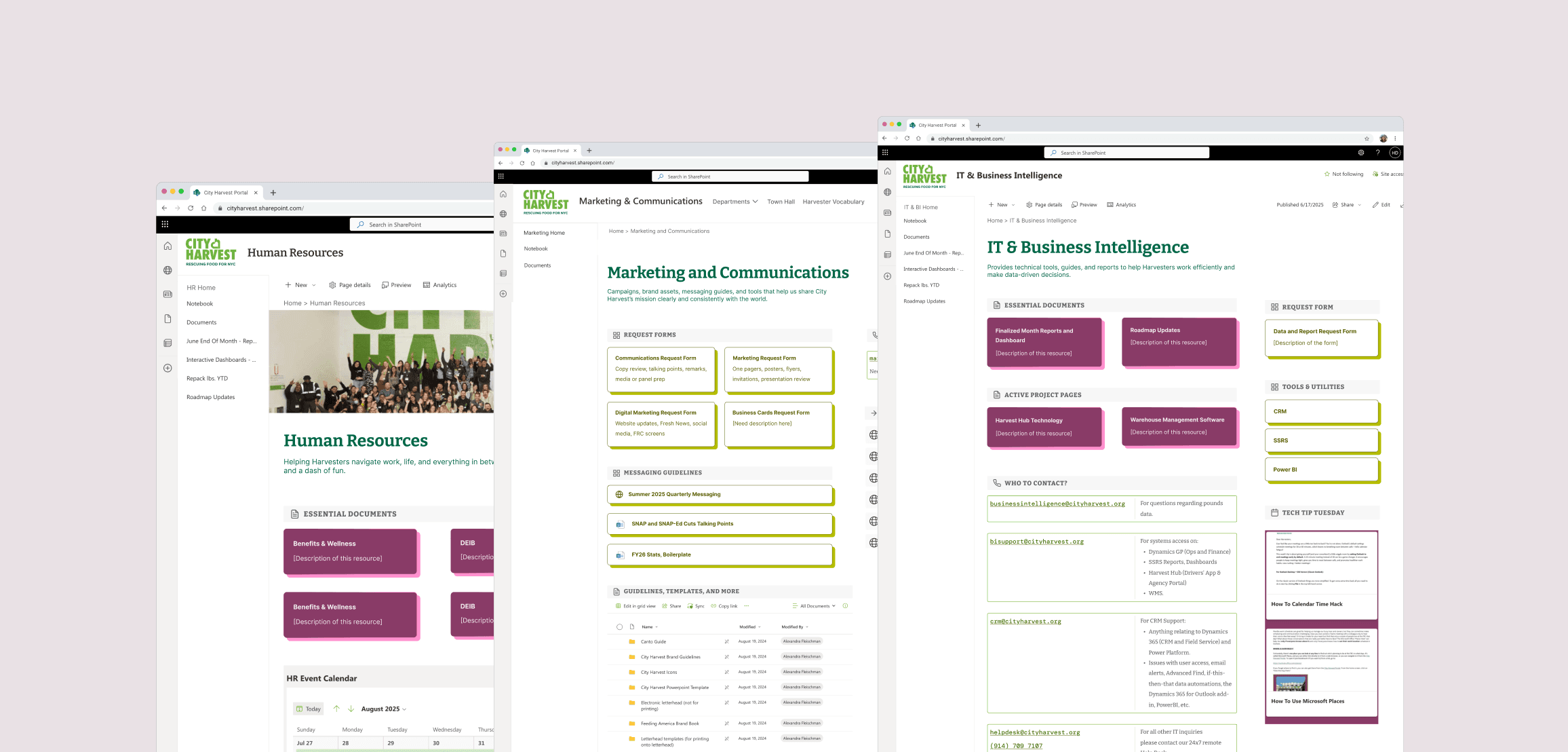
Department templates
Final Designs & Impacts
Final Designs & Impacts
Shipped a redesigned portal for immediate usage by 200+ Harvesters daily. The project included a hi-fi prototype and a detailed research deck handed off to City Harvest's IT & BI team.
Research
Research
Stakeholder interviews & portal audit — Gauging company culture and working habits
My main research goal was to understand what common experiences employees had across the organization to maximize the impact of the design recommendations.
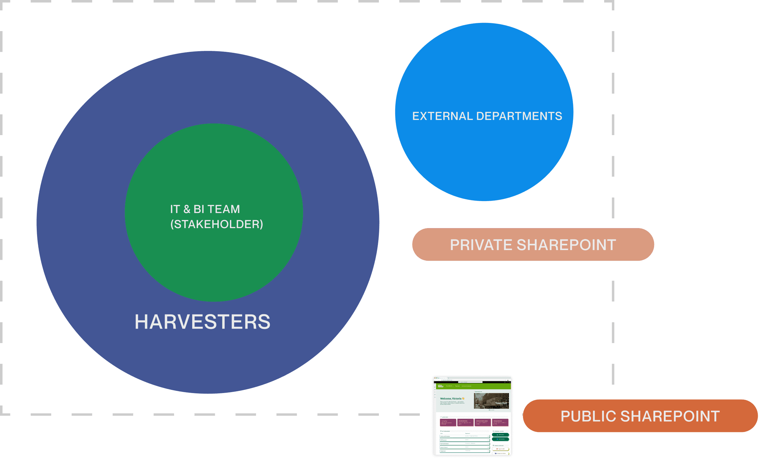
Key Insights
- Inconsistent information architecture frustrates employees for non-regular tasks.
- Employees feel disoriented due to lack of standardized departmental pages.
- Outdated and inaccurate documents across the portal lead to employees completing tasks incorrectly.
33% of user interviewees noticed outdated documents as they were showing us the SharePoint.
Refined HMW opportunities
- How might I rethink information architecture to better accommodate seeking unknown items?
- How might I adapt a standardized template for different department needs?
- How might I use design to help clean up the portal efficiently?
Solution Explorations
Solution Explorations
IA Explorations — Regrouping different types of documents
The portal had little intentional organization or information hierarchy. After testing with Harvesters, categories such as ‘Personal Access’ and ‘Forms & Services’ emerged as guidance for better skimming experience.
Primary screen space reconsideration
Harvesters access information divergently instead of convergently — they search for documents directly instead of finding them through departments. Having departments as a dropdown saves more primary screen space for direct access to key resources.
Design Decisions
Design Decisions
Rebranded buttons with more interactivity
Since buttons/folders were the main functionalities of the site, I developed a new set of buttons that adheres to the City Harvest marketing brand guidelines to bring consistency and interactivity to the portal.
- Original buttons (plain, no brand alignment)
- Iteration 1 — simplified typography and darker color for accessibility
- Iteration 2 — added shadow and hover interaction
- Iteration 3 — changed button labels to be less ambiguous
- Final version — used function colors (not brand color) and added icons for skimmability

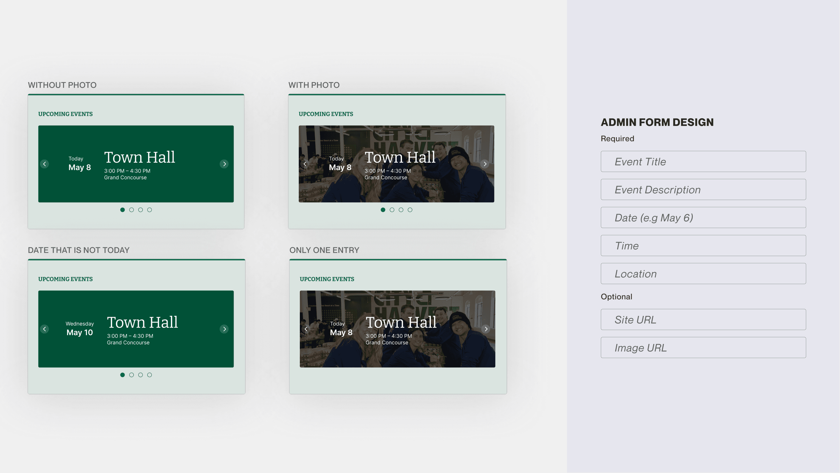
Explorations for carousel design
Towards the end of the contract, I refined the carousel to be essential but not intrusive to Harvesters. I chose the final option as it looks like a physical calendar and deprioritizes images so it doesn't take lots of mental space, while still hinting at the social element.
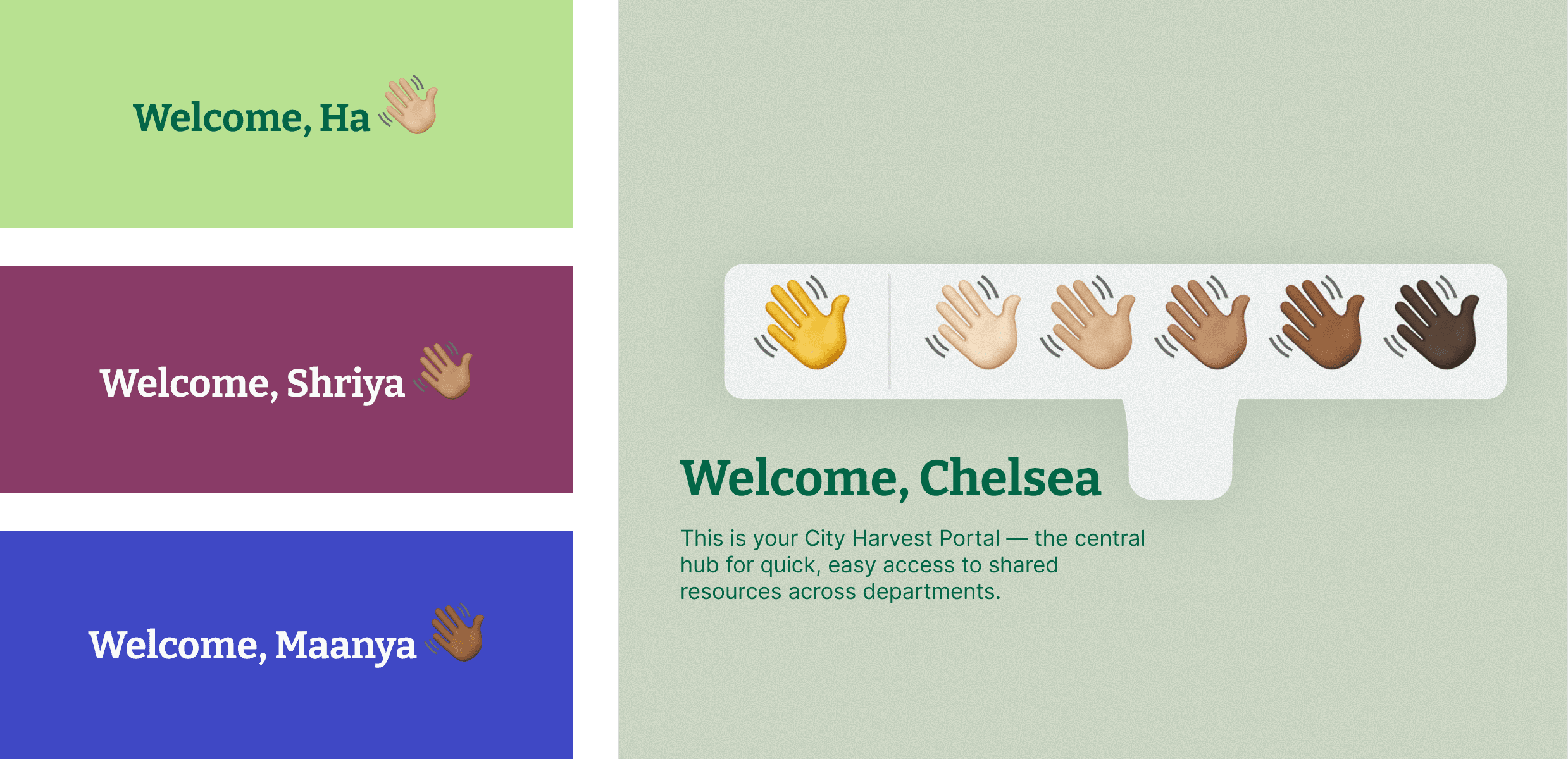
Finally — emojis for sense of community
City Harvest is such a warm and competent community that always pushes and encourages each other to do impactful and meaningful work. As a final touch, I translated that dynamic from real-life into the portal by sprinkling in emojis that can be customized by each employee.
Retrospective
Retrospective
Taking initiatives pays off
Since I worked mainly with non-designers, I developed the skills to really sell my ideas and designs, and invite everyone into learning the design process. The result was that no one was surprised when the final design came out (in a good way).
A chance to practice my component muscle
As there were many different types of files needed from different departments, adapting one component to serve multiple purposes was a fun challenge. With Figma Slots having just come out, it truly felt like I was designing slots customized to the City Harvest Portal.
Thank you to the IT & BI Team 💖
I was truly blessed to have worked with such smart, kind and amazing people. Thank you to both of my managers, Bronwen Stine and Frances Castro, who taught me so much and were so graceful to me during the project.